powerbi-training-en
03 Visuals and interaction
Within Power BI there are many options to adjust the display and operation of your reports. In this module, we want to look at this a little further on the basis of the following points:
- Interactions between charts
- Drilldown and hierarchy
- Using predefined hierarchy
- Customize visuals
- Custom visuals from the Power BI Marketplace
Preparation
Open the file 03-Start.pbit
You might see the following warning:
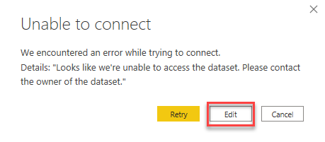
If this happens, click on edit and choose the AdventureWorks dataset in your workspace:

Interactions
In the previous module we saw in Power BI there’s by default interaction between charts. When you click on a chart, other charts will react:
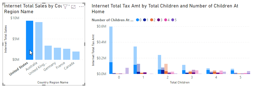
- Select the right chart on Page 1 (Internet Total Tax Amt by Total Children and Number of Children At Home).
The moment you select a chart, two new items appear on the ribbon at the top of the screen: Format and Data / Drill

- Open Format, and click on Edit Interactions

In your report you will now see one or more of the following icons appear in the top right corner of your report except for the currently selected graph:

This determines how the chart in question will react when you change the chart you selected:
- Filter (option 1) - any data not within the selection will not be displayed
- Highlight (option 2, default setting) - anything outside the selection will be dimmed
- Do not filter (option 3) - nothing changes no matter what you click
Try out the three options and see the effects.
Now change the report on the Product Sales page so that:
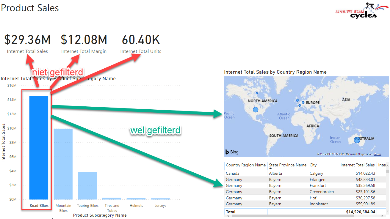
- Selecting a Product Subcategory in the left graph (eg “Road Bikes”) does not filter the content of the three card visuals (Internet Total Sales, Internet Total Margin and Internet Total Units). So these numbers don’t change, regardless of your selection.
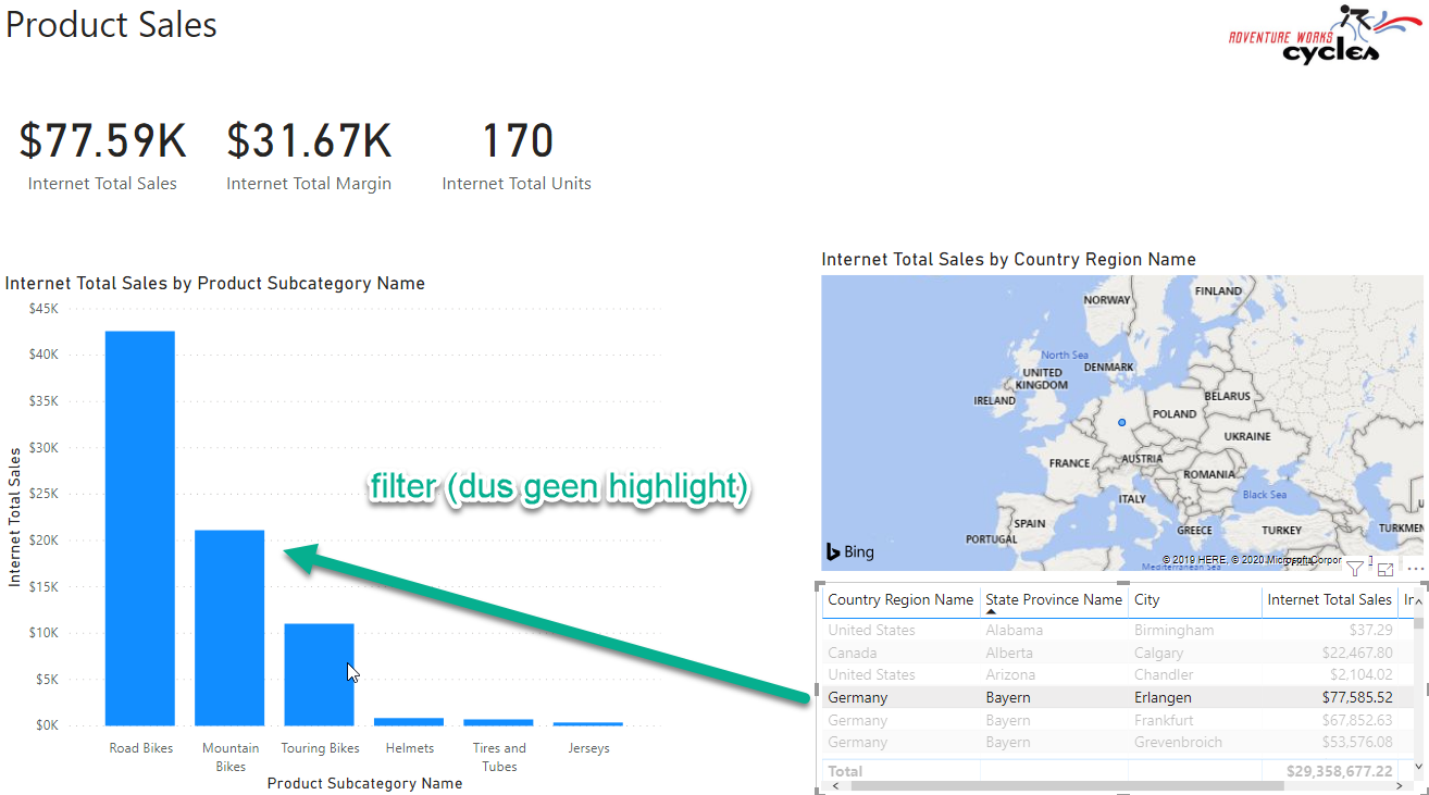
- When you select something at the bottom right of the table (eg “Germany”), the left graph (Internet Total Sales by Product Subcategory Name) is filtered. So only the sales of that table row in question are visible here.
Check the results by selecting “Road Bikes”. The result will be as follows:
Hierarchy and drilldown
Hierarchy
Much of the data we analyze has a hierarchy in it:
- THe first analysis is done on annual or quarterly figures, then we descend towards months or days
- We start with an analysis of the performance of account managers, after which we look more specifically at the underlying customers
- We analyze our product sales by category, see that most sales are in bicycles, so we break that down into the subcategories.
In the data models that we purchase from a data set or Power BI model, data is often already offered in a hierarchy. For example, the Category hierarchy in the Product table:
- Create a new tab
- Select the measure Internet Total Sales
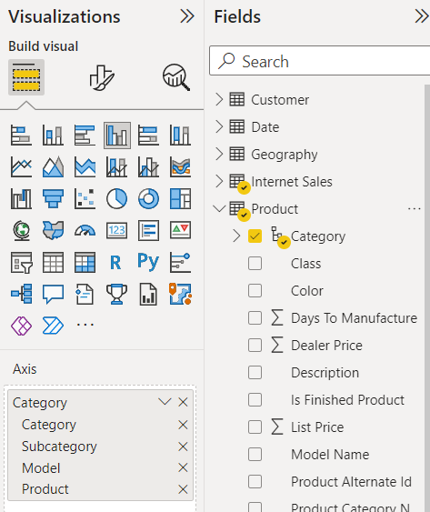
- Select the hierarchy Category in the Product table
- View chart properties.
- Under “Axis” it says Category
- You see various levels here (Category, Subcategory, Model, Product), yet only the highest level is currently visible in the graph.
- Widen the chart a bit so you can see the full title. The title is currently “Internet Total Sales by Category”: the visible level.
Drilldown: first exploration
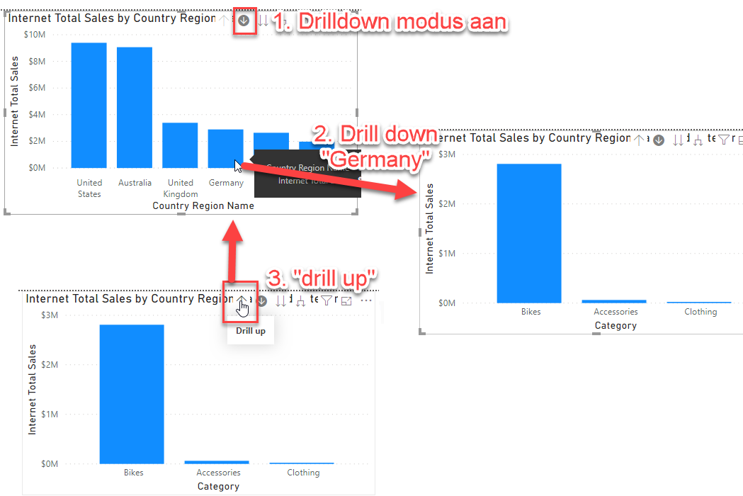
At the top right of the graph is a collection of arrows. These are for navigating through the hierarchy.

- Click on the down arrow (
 ).
).
- This arrow stands for drilldown (the BI term for “zooming in” to a lower level)
- Click on the “Bikes” category. You see that:
- Chart title changes to Internet Total Sales by Category and Subcategory
- The subcategories at the Subcategory level are displayed which are within Bikes
- When you want to zoom out again (drill up), click on the arrow up.
More hierarchy and drilldown
Another hierarchy present in this dataset is the Calendar hierarchy (within the Date table).
- Create a chart that breaks down Internet Total Sales over Calendar.
- Drill down to the year 2020.
- The graph Internet Total Sales by Category now filters along.
Now when we do a drill down on a year, we first come to a semester, and then to a quarter. But we don’t need these levels in our report. So we remove these fields (for this particular chart) from the hierarchy.
- In the properties of the chart, under Axis, remove the levels Semester and Quarter
The hierarchy has now become in this graph Year-Month-Day. Verify this.
Creating a hierarchy manually
- Now select the left chart again Internet Total Sales by Category
- From the Fields pane, drag the Country Region Name field from the Geography table to the Axis field. Place the field above the Category hierarchy.
The chart title is now Internet Total Sales by Country Region Name, and we can do a drilldown further down the Category hierarchy, based on the country we’re looking at.
Go to the next level
In addition to a drilldown, you can also descend a level in the hierarchy without being specifically limited to one category. This can be done with the right two buttons:

In the left graph, go to the highest level (ie Country Region Name), and try the last two buttons. What is the difference?
Filtering other visuals
As you may have noticed, a drilldown also filters other charts: when you select a country in the left chart, the Internet Total Sales by Year chart also changes:
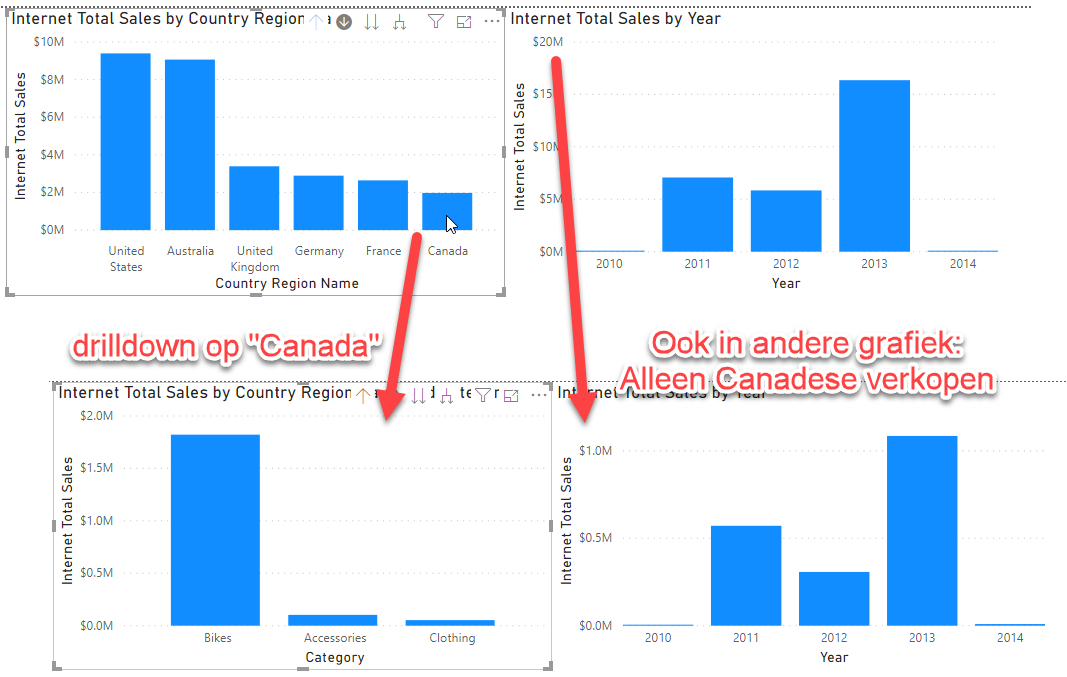
By default, the filtering of a drilldown works the same as the filtering of a selection (which you have set for example via Edit interactions) within the graph. However, you can also disable the drilldown filtering.
- Select the left chart (Internet Total Sales by Country Region Name)
- Open the Format menu
- Next to the button Edit interactions is a pulldown menu, change Entire Page to Selected visual.
Now a drilldown no longer automatically filters within another chart. Selections still work.
Solution
Here’s the endpoint of this lab: 03-Solution
Video
Here is a Walkthrough video
Next modules
The next module is Module 4: Drillthrough. Below is a complete overview of all available modules:
- Introduction Power BI Desktop
- Reporting on a Dataset
- Visuals and interaction (current module)
- Drillthrough
- Self-service reporting
- Data Modeling 101
- Introduction to Power Query (GUI)
- Publishing and Collaboration in Workspaces
- Calculated Columns in DAX